

Stats, splits and the elevation profile
The route card
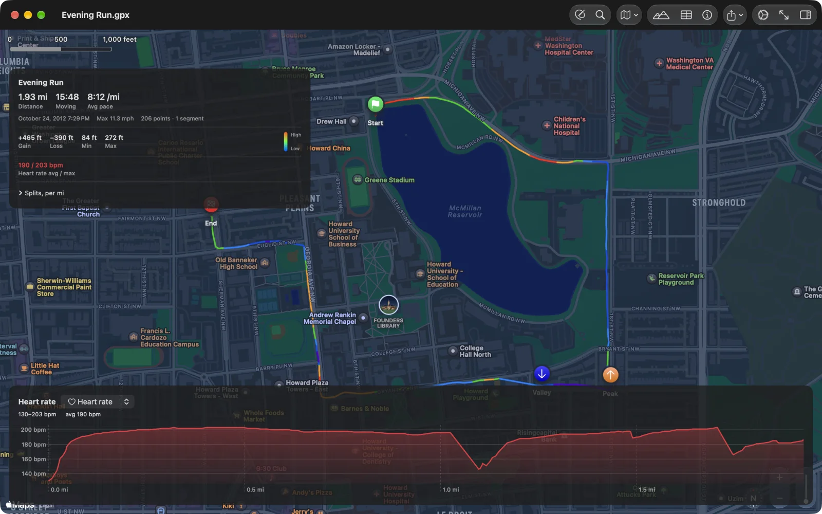
Section titled “The route card”The card at the top left sums up the tracks and segments that are shown (hide some in the tracks list and it counts only the rest):
- Distance, and for a timed track Moving time and Avg pace or Avg speed. Pace is shown when the average is under about 14 km/h (walks, hikes and runs), speed above it (rides and drives).
- The start date and time, Elapsed time when it differs from moving time by more than a minute, Max speed, and the number of points and segments.
- Gain, Loss, Min and Max elevation, when the file has elevation.
- Heart rate, power, cadence and temperature averages, when the file recorded them.
- Splits, per km or per mi: open it for a table of each kilometre or mile with its moving time, pace or speed, and elevation change.
On iPhone the card starts as a one-line strip with the name, distance, time and pace; tap it for the whole card.
How the numbers are counted
Section titled “How the numbers are counted”- Moving time leaves out the stops: any stretch slower than 0.5 m/s for at least five seconds. Average pace and speed are the timed distance over the moving time.
- Elapsed time runs from the first time to the last, leaving out gaps of more than a day (a tour recorded over several days).
- Max speed is the middle of five neighbouring speeds, so one GPS jump does not set it.
- Gain and loss ignore wiggles under 1.5 m, which takes out most of the GPS and barometer noise.
- A planned route’s points carry no times, so a route shows distance and elevation, not time.
The elevation profile
Section titled “The elevation profile”The chart under the map plots elevation against distance, with the minimum, maximum and gain above it. Click or tap Elevation in the toolbar (⌘E) to show or hide it.
- Scrub: move the pointer over the chart on the Mac, or drag a finger along it on iPhone and iPad. A marker follows on the map.
- Pick a point: click or tap the chart, and that point is selected on the map and in the Points table.
- Zoom (Mac): drag across the chart to zoom to that stretch; the arrow button beside the range, or a double-click, zooms back out. While you edit, the same drag selects that stretch instead.
The picker beside the title switches the chart to heart rate and other series.